This chapter is a crash course taking the reader through the elements of visual art, then adding principles of good design and laws of Gestalt theory in order to demonstrate how to make effective visual messages. Beginning with art, the author explains each element such as space (positive and negative), lines, shape/form (organic and inorganic), size/scale, color, texture, and finally value (contrast). By explaining each element, the author prepares the reader to apply these elements to the principles that we’ve already been exposed to thus far.
Next, the principles of good design are explained. The first of which, focal point, taps into the readings in Cairo with examining what the eye focuses when looking at a graphic design. The next, is contrast, which again discusses how difference in the design (whether color, size, or font) will attract the viewers attention to the what the designer wants them to look at. Balance comes in three types: radial, symmetrical, and asymmetrical. Each can be useful in their own context. Movement is the idea that the designer includes lines the assist the viewer’s eyes to flow across a page to essential information. Rhythm/Pattern uses repitition of design elements such as font, colors, or shapes to create a constant theme throughout the design. Lastly, Unity is bringing it all together, making sure that the design works, and all the parts compliment each other.
Combining these elements and principles with the laws of Gesalt’s theory brings to the mind that good design has equal parts English and visual art. However, like with everything, balance is key. What should the relationship be between English (or the message a designer is trying to get across) with visual art?
This target ad is a great example of rhythm, as the repetition of the circles/bullseye design creates a sort of rhythm for the viewer.
In chapter 5, a mini art school lesson is given to provide a basis for the reader’s background in design. There are six main ideas or basics of design that are discussed. Emphasis is placed on how all of these elements work together in order to create an effective design. The six rules of design include focal point or emphasis, contrast, balance, movement, rhythm or pattern, and unity that ties it all together. Focal point refers to that every design should have a specific focal point and place emphasis on it. Contrast helps you keep your design interesting or unique, so providing contrast through colors or patterns makes your design stand out. Balance means making sure that there’s balance between the white space and space that has images, as opposed to having too much white space or too cluttered of a design. Movement refers to how you lead someone’s eye throughout your design, which is done through use of lines. Unity refers to having all of these elements work together. This chapter provided a solid background with a few key ideas to keep in mind when creating designs.
I tried to think of examples that included all of the principles of art provided, but I could really only think of examples where I noticed a specific element or two that really stood out. However, I was able to find an example that had a few of the principles. The iconic iPod advertisements from the earlier 2000s featured good examples of focal point, contrast, and balance. The main focal point is the person dancing and what they’re holding. Contrast is a huge part of this, as there’s a neon colored background, the person is an outline so there’s no distinguishable features, and then there’s the white going from the iPod to their earbuds (which made me laugh because this ad wouldn’t look as cool if they were wearing AirPods instead of having the wire leading from their ears down to the iPod). The balance between white space, or in this case, green space, is effective because the ad is simple and not cluttered, but not too plain.
Question: Which of the six principles do you notice first when looking at a design? Is that the principle that makes the biggest impact on whether you find a design to be effective/aesthetically pleasing or not?
This chapter focuses on the different principles / elements of design which effect how viewers perceive images. The seven principles are: space, line, shape/form, color, size/scale, texture, and value. These elements all work together to attract viewers to a design and fulfill the intended purpose of the design, but each has their own individual importance as well. Color is quite self explanatory, pace refers to positive and negative areas of design, lines are used in a variety of ways, size can emphasize or minimize specific parts of a design, shapes can make designs more memorable, texture can add dimensions to a design, and value (which is essentially just layered shading) adds layers to a design. While some designs may not need a few of these principles depending on their purpose, all effective designs consist of some combination of these principles.
This chapter once again reminded me of my work in helping to design the explanatory internship pamphlet for Senator Rand Paul during my internship with him in Washington D.C. There was a lot of discussion about which color schemes appeared to pop off of the page the most and whether or not images were big enough or too big, and I remember asking myself whether or not any of that really mattered as we discussed all the details of the design. However, looking at the finished product, it was clear to me that the hard work was necessary, as each page had something to attract the reader, despite the information being fairly mundane. When debating the fonts used in the pamphlet, I was especially frustrated with the amount of time it took for our group to make a decision. When considering now how text, which is an aspect of the design principle of lines, can influence a viewers perception of a design, I realize why this was such an important debate. It’s easy to look at a good design or a bad design and say whether or not it is good or bad, but it is often hard to pinpoint why, especially with good designs. With further knowledge of the various principles that go into design, I hope that this will be easier for me and my classmates in the future.
Question: Can anyone think of a design they like, but when asked why they find it difficult to explain? If so, with knowledge of these principles, do you think you could better explain?
SUMMARY: This chapter walks through elements of visual communication and the basic principles that make up good design—principles such as space, line, color, texture, value, etc. Each of these principles contributes to a design in some way. Lines, for example, are associated with eye flow, movement, and perspective. Color, similarly, is a powerful tool because it can draw attention and evoke emotion. The golden proportion and the rule of thirds both function to help designers consider asymmetrical placement that is pleasing for the eye to follow. This chapter also discusses the Gestalt laws of proximity, similarity, continuity, and closure. These elements and principles, used in combination, create meaningful, organized designs that successfully communicate to their intended audience.
APPLICATION: I found the discussion of lines interesting in this chapter because, for such a seemingly insignificant part of art and design (I mean, how hard is it to draw a line?) they’re very important to the process. It takes me back to my elementary school art classes, in which we were taught how to draw lines that moved back across the page and inward toward each other to create what looked like a road unfolding toward the horizon, getting smaller and smaller the further it went. This brought perspective to our artwork.
In design, lines are still used for perspective, but also for a sense of movement, and for eye flow. Eye flow is particularly important in design because, when carefully structured, it can cause the viewer’s eye to flow smoothly across the most important features of the design. Both graphics and text can offer lines for the eye to follow, as in the examples below. Even alignment of the featured article titles allows the eye to move easily down columns of text, while lines in the images—the curvature of a rock face against open sky, or the lines made by cascading water—can point a viewer’s eye to what’s important about the design (i.e., essential text, or a happy guy standing under a waterfall). Lines, then, are a simple, though highly important aspect of design.
Image Credit: interiordesignmagazines.eu
Image Credit: interiordesignmagazines.eu
QUESTIONS TO CONSIDER: Have you had any art classes in the past? If so, what elements do you remember from those classes that could be applicable to design projects? Additionally, were there any elements or principles in this chapter that you were unfamiliar with? How will you begin to identify (and use) them, moving forward?
Chapter 5 of White Space, “Mini Art School,” discusses the six principles or rules of good design: focal point/emphasis, contrast, balance, movement, rhythm/pattern, and unity. Every good design must have a focal point, one specific element meant to draw the viewer’s eye first, to provide order. Contrast in lines, shapes, fonts, and colors helps keep your design interesting; however, repeating some shapes or colors creates a helpful pattern for the viewer to follow. Visual elements also have to be visually balanced across the page, so that positive (image-filled) space and negative (white) space are evenly represented. Horizontal and vertical lines create movement and lead your viewer across a page. Finally, all of these elements must come together as a unified whole in order for the design to be successful.
I often remember principles I learned in journalism and photojournalism courses when I read texts for this class. Many photojournalists rely on these same principles of good design to capture snapshots of extraordinary events and everyday life. Photojournalists have captions to add context to their images, but the images must also speak for themselves. Likewise, I believe good design must speak for itself. Even when a designer is working with placeholder text, their design has to say what the business’ personality, brand, and message is just through its design.
Looking through the eyes of a photojournalist, good designers can become great ones. Good photojournalists follow the rule of thirds religiously for framing their subjects, which helps them create balanced asymmetry. They usually focus on a single subject, so their story is clear, and they strive to choose images with stark contrast in colors or shapes to draw readers’ eyes to their story. They also focus closely on movement and creating lines within an image. Usually, the photojournalist tries to simulate movement through motion blur, leading lines, and the direction their subjects are looking or pointing when they are photographed. If all designers thought like photojournalists, their creations would portray more intention and tell a story for their clients, creating unity rather than a conglomeration of design elements.
Photo Credit: Christian Hoiberg
My question for the class is, “Which of these elements (focal point/emphasis, contrast, balance, movement, rhythm/pattern, and unity), if any, could be left out and still allow the designer to create a piece that’s successful for their client?”
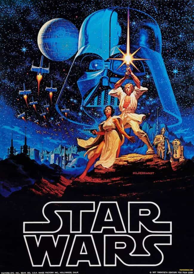
Chapter 5 focuses on explaining the different principles and rules that go into designing graphics and how we as the viewer perceive and process the designs. It begins with the seven elements of design: Space, line, shape/form, size/scale, color, texture, and value. Next it talks about the six principles governing good design: Focal point/emphasis, contrast, balance, movement, rhythm/pattern, and unity. Lastly, there are the four laws of Gestalt which were also elaborated on in the Cairo chapters: Proximity, similarity, continuity, and closure. All of these work together to give us what we perceive as a “good design”, and the most famous of them have stuck around throughout history; from art like the Mona Lisa, to campaign advertisements, and even posters like the famous ones of the Star Wars franchise.
The only example of a striking design that uses these principles and immediately caught my attention that I can recall offhand are the Star Wars posters. I’m certainly not a die-hard Star Wars fan but the way that the posters were designed always stuck with me. They always have the main protagonists at the forefront of the poster, being the focal point your eyes are immediately drawn to, and having the antagonists in the background behind them. They also all have the incredibly striking color pallet of red and blue, symbolizing the light and dark side. The contrast of the colors makes the design visually appealing to look at, and you immediately get a sense of who the major players in the movie are and who’s good and who’s bad. The posters are generally aligned in the middle, with the main characters spread out along the left and right. They also use Star War’s trademark light-sabers as a way to draw attention with the eye and create lines that the characters and generally aligned against, creating a sort of grid for the poster without having actual lines. Even the design of the Star Wars logo is logo is unique and immediately recognizable, again hammering home exactly what you’re looking at.
My discussion question is how many of these principles do you think a design needs to follow before it becomes a “good design”? Is there a specific number like 5/7, or does failing to adequately hit every one mean a design has failed? Can a design still be good if it ignores them completely?
Chapter 5 explains the elements, principles, and theories of design. The seven elements are the ones I will summarize because they serve as a good foundation. These elements are used to communicate through vocabulary terms and through a visual design. The seven elements are space, line, shape/form, color, size/scale, texture, and value. Although each of the elements play a role in effective communication, some argue that color is the most important of the seven. Space refers to the positive (filled) and negative (empty) areas of a design. Lines can be used in text, in alignment to create borders, and in photographs. Shapes are used to make a design recognizable or more memorable, while texture comes from the illusion of 3D dimensional objects in a 2D design, like through a pattern. The size of elements or shapes creates emphasis on a certain part of the design. Value is the shades of light, dark, and gray that falls in between, impacting design by creating layers.
Golombisky said in chapter 5 of White Space is Not Your Enemy, “Pictures such as photography, illustration and painting contain lines that guide the viewing eye through the composition.” I’m a journalism major and frequently work with photographs. I am required to take a couple different photojournalism classes and took an introduction to photography one last year. I learned about a compositional technique called leading lines, which is where elements in the photograph lead the viewer’s eyes in a certain direction. I think finding those elements that create lines in a photograph is like creating a design that leads viewers across the page. Both a picture and a design involve lines and manipulation of those lines to make an appealing image. I vividly remember going to the beach for spring break right after we learned about compositional techniques and seeing leading lines everywhere. I kept my camera on my neck constantly and captured leading lines on the horizon, walkway, hotel, and many other places. Taking photographs was a challenge to me, but I really enjoyed taking pictures and knowing I utilized a technique on that trip. Graphic design will probably be a challenge to me, as it is something I don’t already feel comfortable with, but I think I can use techniques, maybe lines, to create a good design.
How important is texture when creating a good design? Could texture be the least important of the seven design elements? Of all the elements, principles, and theories in this chapter, texture was the one I was most surprised to see. Compared to color and lines, I don’t think texture holds the same impact and influence.
To start off chapter 5, we quickly review and discuss elements, principles, and the four Gestalt laws otherwise known as the “crap” principles. Knowing these theories helps you in a few ways. The first use for them is that you can have a wider vocabulary when discussing design, and secondly you can give more of an affective message about your work. The Elements are space, line, shape/form, size/scale, color, texture (texture is mentioned and described as overlapping shapes and use of shadow to create illusions.), and value.
Along with the elements, the chapter goes into further detail with discussing the principles of design which are: focal point/emphasis, contrast, balance, movement, rhythm/pattern, and unity. The principles are important because they are the steps we must take to ensure success with creating our project. The magic of the principles are that without one single one of them, the design won’t be good.
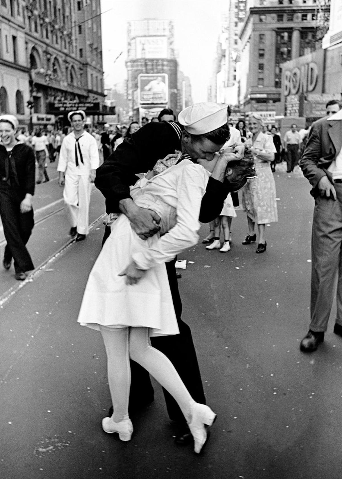
2. An example that came to me was in response to reading about what value is. Value was mentioned as referring to dark and light. The contrast between the angels in highlight and the dark background creates drama and mystery. Immediately what came to my mind was the famous controversial picture of the WWII soldier returning from war and kissing his bride. Between all the white and black of the photograph we experience the varying shades of gray. As referenced in the chapter, black and white photography works visually because, after white and black, the tonal values of gray stand in for other colors.
The picture was taken on the day of August 14, 1945 that later became known as V-J day. The man was just returning from being in war and was greeting his then wife who is now confirmed to have been a 21-year-old dental assistant at the time. This photo became one of the most famous photographs in America, especially around the time of the end of the war because it reminded Americans of the upcoming possibilities that future held without war. New opportunities in America were going to begin happening as well allowing family’s to finally be able to feel normal again with their loved one’s home form war, if they made it back. It was a scary time in United States history, but also a celebrated one!
Question: What is another famous photograph that comes to your mind that occupies a lot of value (black/white) and significance?
Chapter five covers the elements of art, principles of design, and gestalts principles. The part that stood out to me the most was the information about the golden proportion. The golden proportion is 1:1.618. Golden rectangles can be found all over the place in art and design. The design is universally appealing and pleasing to the eye. It allows for visually pleasing asymmetry that follows the rule of thirds. Essentially, the rule of thirds is a 3×3 grid inside of a golden rectangle. This rule places the focal point on one of the four grid line intersections creating an appealing balance in photography and design.
This chapter reminded me of time on the yearbook staff in high school. Since we had a small staff, everyone kind of did everything: writing, designing, taking photos, etc. In all capacities, I remember the rule of thirds being a big deal. When building layouts, we had to keep in mind the rule of thirds when designing the page and keeping the photo/module/negative space balanced, but we also had to keep this rule in mind when shooting events as well. If we built a nice layout, but didn’t follow the rule of thirds when taking pictures, then either we couldn’t use the picture where we wanted to, or the whole page would look off and unbalanced. For example, someone’s face would be in the gutter or the photo would have to be cropped in a strange way. The size of our text boxes for feature stories also followed the golden proportion (even though I didn’t know what that was at the time). Line was also a huge component of our work. We had to ensure that all or our photos and text boxes aligned with each other and that there were lines of negative space and lines of color to guide our eyes to the feature photo on the page.
I did a little bit of research about the golden proportion, and I was fascinated by all of its occurrences in nature and design. Do you think this design occurs so often in design because it is pleasing, or is it pleasing because it occurs so often?
Chapter 5 of White Space is not your Enemy deals with the elements, principles, and theories of design (as the title suggests). I’m going to be focusing mainly on the principles of design, because those were the things that fascinated me the most.
The first principle they talked about was the focal point. The “focal point” refers to the center of attention of any design. It’s the thing that the viewer is supposed to look at first, and it can be pretty much anything, so long as it stands out from the rest of the design. It can be differentiated by being bigger, brighter, a unique shape, or any number of other ways, all of which create some form of contrast. Contrast, coincidentally, is the second principle of design. It denotes the differentiation of different things on the design to keep it interesting. You can achieve contrast any number of ways. For example, you may choose to contrast two different textures, or light and dark colors.
The next principle is balance, and this is the one that I find the most fun to play with. Balance involves making the design feel like it is equal in visual weight… Or intentionally making the design feel unequal, heavy in one specific area. This happens because every aspect of a visual design has a certain “weight” to it in our minds, and it’s pleasing to us if that weight is evenly distributed throughout the page.
Next is movement. This principle is about the way that lines are used to control the path the viewer’s eyes take across the design. Apart from the inherent usefulness of this, it can also be use to communicate specific meanings. For example, vertical designs communicate stability, while diagonal lines communicate excitement.
After movement is the principle of rhythm. Rhythm is kinda like the recurring motifs in a design… The patters that occur throughout the entire piece. Repeating visual elements like shape, color, and font all create a rhythm for the design, giving it a feeling of personality.
Lastly is the principle of unity, and this one is tricky. Basically, it means that the whole design just “works” together. Its various pieces all relate to one another and feel connected and consistent. You want everything in the piece to seem like they belong together.
So how about an example of what I mean. Say you’re designing a movie poster. Generally, you’re going to want the poster to be balanced, but you also want contrast in shape. Ergo, I’d suggest putting your main characters on one side of the poster, and some important element on the other. So, if you were designing a Star Wars poster, you could have your heroes on one side of the poster, all posed and cool, while spaceships or alien monsters take up the other side. Similarly, you can use contrast in color to differentiate the heroes from the villains. In Star Wars, this is actually already done for the designer. Most of the villains wear dark and aggressive colors like black and red, while the heroes often where light and non-threatening colors, like white and blue.
While creating your Star Wars poster, you’re also going to want to create a focal point, and luckily, in most Star Wars movies at least one character has a lightsaber. Have one character holding that bright lightsaber straight up, and you create an instant focal point, while also using the properties of movement to make the main character feel dependable and sturdy. In addition, you can also use movement in another way. Since diagonal movement creates distraction, you can have spaceships, lasers, or another lightsaber positioned diagonally to communicate the high levels of action in the film.
As a side note, Star Wars has always been famously good at creating posters, so it was really fun for me to analyze exactly what techniques they use to make those posters so compelling!
So my question for the class today is this: out of the principles, which one do you find the most interesting, and why? I, for example, like the principle of balance, because I think it’s fun to try and measure the “visual weight” of different objects and try to put them all together in a pleasing way. Plus, I think that playing with balance can create some cool designs. So, in that vein, which principle of design holds the most interest to you, and why did you choose that one?
Thanks for reading my post, and may the Force be with you.
The famous poster design for the first Star Wars movie. Notice how the principle of movement is used. Luke and his lightsaber form a straight line, making him feel sturdy, while the X-Wings fly in a circular pattern to denote action. The X-Wings and Death Star also serve to balance out the visual weight coming from Luke, Leia and the Droids. Truly, this will be a design long remembered.