ASL Music Videos

Janine Butler’s article “Where Access Meets Multimodality: The Case of ASL Music Videos” offers an understanding of the benefits of ASL music videos on methods of communication. The article covers the ideas of embodiment, multimodality, accessibility, and pedagogy. The author argues that ASL music videos are more accessible to audiences due to the deployment and utilization of various modes of communication. Movement, captions, and design all work together to create a cohesive video that portrays the content and emotion of music. The author desires individuals to recognize the need for accessible content, especially in the classroom. The pedagogy sections were particularly interesting because the author illustrated how they challenge students to learn about and create ASL music videos in order for them to better understand their value. Students are required to analyze, design, reflect on, and redesign an ASL video in order to thoroughly comprehend the accessibility of multimodal compositions. 

My first year of college I took ASL, and we discussed the significance of ASL music videos in the deaf community. Movement combined with signs helps convey the content and emotion of songs. I was interested to learn about how captions are also incorporated into ASL music videos. I did not realize how important timing, placement, font, and size of captions contributed to the overall music video. During this course, we have paid a lot of attention to font choices to ensure we choose fonts that portray a certain meaning or tone for our document. The importance of those decisions are amplified in ASL music videos. It is really easy to see in the ASL music videos how important these font choices are. The wrong font or size could drastically change how the content or emotion is perceived. With regards to the idea of pedagogy, it is important for students to practice and obtain analytical design skills, so that they can create accessible content. In ASL music videos, they are able to utilize multimodality to communicate the message of the music video as clearly as possible. Design students should fully understand the power of each mode of delivery that is incorporated into a document or video, so that they can better choose how to fully and clearly communicate a message to a variety of audiences.  

How can you apply the idea of multimodality to create stronger rhetorical strategies in different types of mediums other than video? 

Image Credit: Pinterest.com

Memes and Rhetoric

From the reading, my favorite definition that emerged was from the “Why do Memes Matter?” article. This article explains that memes “serve as an expression of people’s opinions and emotions. Memes can be formed by appropriating scenes or lines from TV shows and movies, which are then taken out of context, remixed with other content and have new meanings attributed to them in a funny and relatable manner.” I like this definition because I think it is what my age group most easily recognizes as the function and purpose of memes.  

Writing is an important part of a meme that can often contribute to the effectiveness of a meme. While the writing can generally be done by anyone and be accomplished quickly, it is important that the writing connects to a specific audience. The reason memes are so popular is because of the tendency for them to connect with people and express ideas that people find relatable. Memes are able to take images or clips out of context, add text, and make them relevant to a particular audience. 

Visual rhetoric is also an important part of a meme that can contribute to the effectiveness of the meme overall. Images used for memes are often pulled out of context which can often make the visual rhetoric not seem purposeful. However, these images are typically about movies, characters, or celebrities that people are familiar with which contributes to how the meme is received. In addition, where the text is placed on the image also adds to how effective the meme is. I think it is a little bit more difficult to see how visual rhetoric is effective in memes because of the arbitrary nature of the images, but the familiarity audiences have with image assists in helping people connect to the message overall. 

For businesses, it can be more difficult to create a meme that both connects with an audience and promotes their business. The writing part of a meme is often so brief that it is a challenge to specifically promote a business or service. The better examples I have seen of businesses using memes for marketing is to focus their meme on an issue or annoyance people experience that the business is skilled in solving. This helps them create a problem-solution scenario that people want to respond to. 

Podcasting and Audio Essays Activity

1) One similarity between writing a text-centered essay and an audio essay is the use of emotional appeals. In order to engage an audience, it is necessary to use language, phrases, or stories in a way that evokes emotion from a reader. In rhetorically focused text-centered essays, this mode of persuasion is usually evident through the vocabulary choices and evidence provided; however, with an audio text, I think it is even easier for audiences to pick up on the power of the emotional appeals. I think this is due to hearing the tone and emotion in a person’s voice accompanied by the background music that is usually incorporated into audio essays. 

2) One of the biggest constraints of working with audio essays that is not present when working with text alone is having to record, organize, and edit audio clips. One of the bigger challenges a lot of the audio essay writers mentioned was learning how to create, splice, and combine audio clips. This could be interviews, personal narration, or background music/noise. The sound drastically impacts the story they are trying to share which means that there is generally less room for interpretation. This means that the creators of the audio essays have to work extra hard to ensure that every sound, tone, or quote matches their intended purpose and goal. 

2) In “Life Left In Me” by Theo Greenly, there is a lot to gain by his essay being presented in an audio format. Because his story is a combination of bits and pieces of various interviews intertwined to create one storyline, the story would have to be very differently told if it was presented in a written format. The emotion that is present in his audio essay would not be as powerful if the audience was not able to hear the stories from the people themselves. In addition, the music in the background contributes to the overall emotion that the story evokes. If this story was simply a written text, it would not be able to be formatted the same because there would have to be a narrator introducing the quotes. It would also not be as easy for the writer to intertwine the stories of each individual that was interviewed. The power and emotion of the stories told would seriously decrease if an individual was just reading the essay.

4) I think that stories that are more emotionally charged and lyrically written would do well in an audio format. Also, I think writing that is more focused around interviews as sources rather than academic journals would make better audio essays. These types of essays would be better in an audio format because they focus on strategies that create a connection between the audience and the writer or who is being written about. I think that text that would not do as well in an audio format would be writing that reads more like a report. In addition, it would be text that heavily relies on quotes from academic or scientific journals. This type of writing tends to not be as emotional but rather fact based which would not be as powerful in an audio format.

Interactive Storytelling Activity

In order for a Twine story to have strong writing, the script must use quality and engaging words and structures. Players do not want to read a full wall of text when they are playing an online game; however, they do want enough content to where they are invested in the story line. Players want stories that will pull them in and make them feel included. Of the five Twine stories we viewed, I think the best writing comes down between The Temple of No and Horse Master: The Game of Horse Mastery. The Temple of No definitely had the most engaging writing because it made the player feel included and the story had an fast-pace rhythm that matched the writing style. However, Horse Master, even though it was incredibly disturbing, clearly paid a lot of attention to the writing to ensure that it would be informative and engaging even if it was in a gross way. 

I think the most interactive of the five games was The Temple of No, and I think the least interactive of the five games was The Writer Will Do Something. The more interactive games I think felt that way because the writing was interesting, you got to make a lot of decisions that made you feel involved, and there were graphics that assisted in further sparking the imagination of the players. The less interactive games relied on a lot of text, and there were less options for the player to make real decisions. There were no graphics or background noise that helped pull the player further into the game.   

I do think that writing can be interactive based on these five Twine stories that we have viewed. I think it is the same type of interactivity as a video game; however, possibly not as extensive. The writing definitely serves to engage an audience, persuade them to take action, and make them feel involved in important decisions, but in video games, I think that there is a lot more agency on the part of the player which makes it feel more interactive than writing in general. In a video game, the player would be responsible for running away from danger, and they would most likely get to choose speed, direction, and there is the possibility that they will not make it. In the interactive writing we viewed, we had to run from danger, but we only had to press one button, and then we got to watch it happen. The danger did not feel as imminent because you only had the one option that you did not really control.

Canva Activity

Question 1: I chose to use a Facebook post template called “Blue Abs Fitness iPhone Layout Facebook Post.” I chose this template for a couple of reasons. First, I liked that this template distinguished the image from the rest of the post. A lot of the other templates either incorporated the images in different ways or didn’t allow space for images. However, I wanted to be able to prominently display a photo of my speaker since people may be unaware of who he is. Second, I wanted a simpler design that did not involve a lot of background noise or infographics. This template had limited parts which I thought would allow more space to be creative, but also focus on the information. It was difficult to find a template to promote my event because I was trying to find a template that would match the tone of the graphics I had already created. For my second graphic, I choose the template “Photo Background Minimal Text Facebook Post” because a photo background obviously does not work for every event which is evident in my example. In addition, the lack of color and the intense typeface does not accomplish the friendlier tone needed to attract a young audience to an event with a speaker they may not know.


Question 2: Originally, I had thought that it was easier to work with Canva rather than InDesign because I was inexperienced with InDesign; however, after working with InDesign, I found myself getting frustrated with certain aspects of Canva because my options felt limited. Choosing and conforming to a template makes it difficult to be creative. I think it was easier and quicker to create a graphic overall because I didn’t have to decide on a layout, but I rather had to just fill in information. It was easier to move images around because I was not fighting with frames. However, I think it was harder to situate and increase the quality of images. Also, it was harder to work with text because you could not move letters or spaces individually; all of the text moved in unison. It would also be more difficult to create multiple graphics for one event using a template-driven program because it is difficult to find templates that match in tone and appearance.

Gallagher’s Article

Gallagher’s article, “The Rhetorical Template,” is a response to Arola’s article. Gallagher addresses the issue of templates in Web 2.0; however, he argues that templates do not necessarily result in the complete separation of form and content. He asks, “is filling in a template the rhetorical situation, or is filling in a template part of the rhetorical situation?” (Gallagher 1). Considering both the rhetorical lens and genre theory, he believes that writers can utilize templates in creative ways that allow them to still enhance the rhetorical form of content. For example, he previews a series of his own Facebook posts. He illustrates how his profile picture and cover photo can work together to show separate parts of an individual’s identity or in unison to create a larger image and meaning. He addresses, however, how this meaning can shift when the information is presented in a different form, but he introduces multiple ways writers can creatively alter that. 

It is incredibly important to consider how we add to the rhetorical situation of any type of media. Social media in particular has become such a large part of our society. If the template was a hindrance (like Arola suggests), it would be unfortunate to know that our society is unable to rhetorically contribute to form on social media. However, if we take Gallagher’s argument into consideration, it is easy to see various ways society has made strategic decisions on social media in an attempt to manipulate a template, so that they can add to the rhetorical meaning of the form of their content. Thinking about the idea of how rhetoric is such a large part of our daily lives, it makes me think about Cicero’s five canons of rhetoric, which I am studying in another class. These include invention, arrangement, style, memory, and delivery. These ideas are prevalent in everything we create even if we are not consciously applying them. Gallagher suggests that within the confines of a template there are various ways that individuals can arrange content in order to further some type of rhetorical meaning. While each of these canons is present in an individual’s post, arrangement gives people the greatest means of contributing to or altering the form of their content. It is important to be aware of how we as users of social media can “manipulate” a template in order to combine both form and content into something purposeful. 

Question: What are some ways that writers can use templates in creative and unexpected ways? Do you see yourself utilizing these strategies in any of your online content?

Image result for funny meme about social media templates
Image Credit: Pinterest

Arola’s Article

Arola’s article discusses how web technologies and experiences have vastly changed over the years. Web users used to be much more involved in the rhetorical design of web pages; however, due to the rise of social networking, those important design decisions have become obsolete. Platforms, like Facebook and Myspace, do not allow the opportunity to truly alter type, color, or layout. These types of platforms have preset templates that encourage users to consume the content in specific ways. While Myspace does allow users to alter the template they use, users information is still presented in the same way. This shifts the focus of design more to content, like text, images, or audio clips. Because users are no longer focused on specific design decisions, they are becoming less aware of the rhetorical techniques of design decisions and what they mean. 

From Arola’s reading, I found the strategic design of social networking templates incredibly interesting. I had never really considered before how these websites are specifically designed to encourage users to consume content in a certain way. In addition, these templates display who we are in certain ways. This article is a little outdated since it focuses on the use of Myspace which is no longer a popular platform. With this in mind, I thought it would be interesting to analyze how Instagram encourages its users to navigate its platform. 

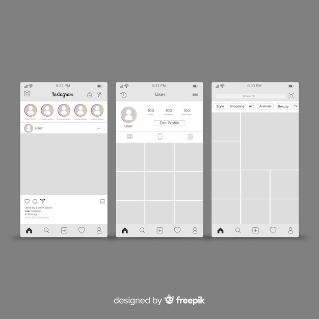
Instagram, like Facebook and Myspace, focuses on content because there is a lack of personalization with regards to template design and layout. However, this platform focuses on images as its main form of content. On a users page, their image is displayed in the top left corner followed by information, like posts, followers, and following. Below that information, there is space for users to fill in an “about” section where they can add any information they deem important. Below this information, each of the users’ posts is displayed in a grid. This page focuses on the images the user posts because it is the largest portion of the page. It is similar to Myspace in the sense that it focuses primarily on what that user has posted. Instagram’s homepage is similar to Facebook’s news feed because it displays content from everyone an individual follows. Each post has the user’s profile picture which is followed by the user’s username at the top. Below the information, is the image which is followed by a caption and any comments. The image is the largest part of each post which puts the emphasis on the image part of the content. Because users do not have to focus on rhetorical design decisions, they have to use images and text to portray themselves, but this method is obviously limited. It is important to understand how these social networking platforms hinder individuals from displaying themselves to the others online.

Question: What are the potential benefits or disadvantages of not being able to make specific design decisions, like color, typography, and layout, on social networking sites? Do you think it is more beneficial or harmful and why?

Image result for instagram template
Image Credit: Freepik

White Space: Chapter 9

White Space chapter 9 discussed a lot of important information related to utilizing photos and illustrations in graphics. When choosing photos, it is important to ensure that they are imported as high quality images. They must be well composed and follow certain design principles. If your document contains more than one photo, it is important to show contrast between the content of your photo selections. It is also incredibly important to consider issues such as ethics, diversity, and legality when looking to capture or acquire photos. However, if utilizing photographs will not work for your project for some reason, illustrations, clip art, video, and type are also important aspects of design that can help serve the same purpose as a photograph. 

One section of the reading that I found interesting was the discussion of what to do in a situation when you are choosing more than one photo for a design. I always assumed you would just choose another photo you liked. I never really considered the intent and purpose behind those decisions. This section focused on how the design principle of contrast is vital between various images on a single document. This means that designers should consider the scope of their images when they are choosing photos that contrast. They called this choosing an established shot and choosing a detail shot. An establishing shot is a more broad view of an event or location whereas a detail shot focuses on a single activity or place. This helps illustrate a more in depth view of an event or location overall by offering a variety of angles. I see this a lot in the world, especially in newspapers, magazines, and websites. If they are advertising for anything, there is definitely a photo that is more broad in scope and one that is more focused in scope. Below is a screenshot of the website for Chaney’s Dairy Barn. On the website, you see an image of the barn in general, and then you get an up close view of their ice cream and their mugs. This is a prime example of using photos as a means of contrast on a design. 

Question: In general, when you look at a design on a poster, website, magazine, etc., do you prefer if the design includes photos or illustrations? Why? Does it vary between different situations? Is there an inherent value to photos that illustrations just cannot simply match?

Image Credit: Chaneysdairybarn.com

Good Designers vs. Great Designers

The articles “Good Designers Redesign, Great Designers Realign” and “Good Designers Copy, Great Designers Steal” discuss the importance of re-purposing designs that already work. The main focus of the first article mentioned is to not look at design from a mere aesthetic viewpoint, but rather drive you design decisions from a point of purpose. If we look at design from this perspective, the author argues that we will be more likely to work with the design we currently have, amplify that design to match our purpose, and be more successful in the process. The main focus of the second article mentioned is the importance of reviewing other designs and utilizing what has worked in those past designs in your current design. The author argues that we should copy already created designs (either others or your own), but we need to make them our own. The author also points out that if we are going to steal a design, it needs to be something obscure or unknown. Both of these articles emphasize the point that great designers should use resources and examples of great design that already exist in the creative space to be successful.

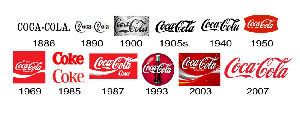
The concept of realignment from the “Good Designers Redesign, Great Designers Realign” is incredibly important. There would be a lot of time wasted if every designer decided to completely overhaul and restart a design when a problem occurred. Instead of jumping into a complete redesign, designers need to stop and consider what is missing, what can be improved, and will this prove more effective. If designers consider these questions, they will be able to approach a design project from a different point of view. One popular design that a lot of people are familiar with is logos for soda companies and fast food restaurants. We have all grown up seeing these logos around us either physically or on commercials. These logos have definitely altered overtime, but they have maintained similar and consistent aspects throughout. That is because the designers of these logos recognize that the logos work and are recognizable, and that they only need to alter the design slightly to better meet their brand’s purpose and expectations currently. Below is an example of how Coca-Cola has altered their logo overtime. If you were to just jump from the first logo to the last, it would be harder to see the similarities. But looking at the logo overtime, it is easy to see how the exaggerated “C,” decorative letters, and the mixing of the colors red and white have remained consistent and only changed slightly during the progression of their logo.   

Question: Stealing designs seems like a slippery slope towards plagiarism. What makes stealing designs not plagiarism? If we attempt to copy/steal designs, how can we better prevent accidentally crossing that line into plagiarism?

Image result for soda logos that have completely changed
Image Credit: UPrinting.com

Chapter 8: Color

Chapter 8 of White Space Is Not Your Enemy discusses the importance of color when designing a graphic. Color must be used strategically which is why there are certain “rules” that should be followed. The colors chosen for a graphic should communicate something purposefully. Colors can evoke emotion and signal organization, so it is vital that colors are chosen with these concepts in mind. Quality color schemes can be achieved by using the color wheel or nature for guidance. It is incredibly important that when designing with color, a designer ensures that visibility and readability are not compromised by outlandish color choices. Understanding the value of both contrast and unity on a document is a valuable tool for deciding what colors to use together. Finally, the chapter discusses the importance of knowing the different color languages, which are RGB, CMYK, and the Pantone Matching System. Fully grasping each of these concepts related to color will prove beneficial for creating eye-catching and effective graphics. 

One topic discussed in chapter 8 is how color can be used for emphasis. Color can easily serve as a focal point on a graphic that assists the viewer in navigating a document. Using color for visual emphasis comes down to the idea of contrast. Contrast involves using opposite colors on the color wheel, using warm hues with cool hues, using any hue with a neutral hue, or mixing dark and light values. The strategic use of color is essential for creating graphics that catch people’s attention and guide them through the visual. Below is a bad example of the use of color. It appears as if the designer had too hard of a time deciding which colors to use, so he just used them all. This hurts a viewer’s eyes and makes it difficult to know where to look. Contrast could have potentially been achieved if the designer had kept the typeface in a neutral color. However, the designer chose to use a bright orange from the rainbow background which results in the color and graphics bleeding together even more. Contrast helps readers with visibility and readability. The lack of clear contrast and purposeful color choices in the example below hurt the design of the document because it makes it difficult to quickly understand and read. 

Question: Chapter 8 discussed how color is often associated with culture, and the author mentioned a few examples. What are other examples of certain color schemes that are heavily associated with culture (either a holiday or a time period)? What do these symbolic color schemes say about the power and impact of color in our culture? How can this knowledge be used to the benefit of your designs?

Image result for bad use of color on a graphic
Image Credit: Sitepoint.com