This was more than a LIDDLe fun

One of the most interesting thing about memes is that a more complex thought is taken into a few words. Memes are highly important because they trigger readers to actually think about such a topic but normally in a fun way. To me, memes draw me to look into topics that I did not know about. On the other hand, sometimes they are great for a fun laugh about a show or topic that you love. Since memes are so short, what they say has to be concise but informational at the same time.

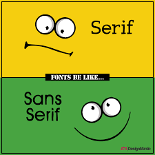
For memes to be effective, the type of picture and language used has to be thought out. It is also very important that the meme is visually pleasing in order to catch readers attention. The meme has to specific to a topic and also be culturally sensitive. One thing that I do not pay attention too much is the actually type of text and typeface used, so I would consider this less of a problem. I would say that visual effectiveness is more important that the writing aspect.

Do you think the visual component or writing component is more important for memes?

Old Delivery vs. New

Delivery in the Roman times was definitely different than now. The way they had to deliver things were by words, body language and their annunciation. Most things were done in front of an audience; therefor, the way the spoke was everything. This would also affect the audiences reactions and take away from the performance. Obviously, when things were now printed on paper, they way people spoke did not convey the same as before. What was previously based on reaction and perception, was now having to be taken from paper.

Although you can not directly see an audiences reaction, as far as accessibility, I feel like it is way more accessible. Print can reach far more people and audiences than a play in person. No, it is not as interactive. Simply on the fact you can not experience the speakers emotion as well. However, games like Twine help with interactivity and make you choose choices based on personality. It may not be able to reach the same level of instructiveness (is that a word) but it is more accessible.

What are other ways we can add interactivity into our studies, especially with a lot of classes being virtual?

You Make the Decisions

What I think is one of the most important aspects of interactive fiction, is that you decide your outcome based on your choices for the characters. Just as Albano stated, for once the audience gets to make the decisions instead of pre-decided outcomes. This seems to be a major benefit and I feel like one could learn a lot about themselves based on the different outcomes that they receive and the choices that they make. This makes it seem much easier for the players of the game to relate to what they are playing on a deeper level than regular video games. There is some issues that could possibly arise. One being that I think loosing an audience could be easy if the layout is not done efficiently. If the player did not like the outcome based on their choices they make or if the game has too much or not enough text. The game would need to be just enough text to keep the players attention but not too much where they get bored or tired of reading.

Interactive fiction can be more challenging than other games. It is definitely more restricting and the guidelines are a little tougher than games that use more visuals. It is very important to keep the audience entertained.

What are some restrictions that you could see being a problem with interactive fiction?

I Actually Liked Canva..

To begin, I was very surprised with how much I liked Canva. This may be because I am not a very creative person on my own so this made it easy to navigate and pick a template that goes with your ideas. I am also a very organized person so the thought of using a template is appealing to me. I have had some trouble with the other design programs we used because you are starting from scratch which I find overwhelming and challenging. I do think a negative to Canva is the restrictions, for someone very creative and artsy they would probably have better luck on something like indesign, publisher, or pages. I also think for companies wanting something unique that Canva probably would not be the place to go.

I actually did have a hard time breaking the rules within Canva. I think this is because the template makes it a little harder to bend some rules. So I decided to use all caps and different fonts along with a hard to read text color. I already have a difficult time breaking the rules with my OCD, so I preferred breaking them in Canva because I felt like I couldn’t do anything too wacky. For an easy social media ads or flyers I think Canva would be perfect.

Did anyone prefer Canva over the harder design programs we have been using?

I Shot the Serif, But I Did Not Shoot the Sans Serif

To begin, I chose the game “I shot the Serif.” The main reason I chose this one was just because it reminded me of the song which I found interesting and fun. The main purpose of the game is just to be able to identify the difference between Serif and Sans-Serif. Honestly, before taking this class I would not have been able to tell the difference (which I know is sad). This game was extremely helpful to me for this reason.

The skill that it teaches you is how to identify the difference and to “shoot” the Serif. I did well at this game, once you identify which is which it is fairly easy to do well. So as far as teaching you the skill, it does do that. However, that is about the only thing that it does. I found that after doing this game for a while it definitely got pretty boring. As the only objective is to identify the difference, there is not much going on with that.. so it becomes pretty stagnant in the game.

The exercises and projects are probably the most useful to me in how I learn. Sometimes, I feel as if there is no better way to learn than to just dive in to an assignment. However, small games like this could be useful for different things. Such as, I did learn the difference of Serif and Sans-Serif which was the point! Sometimes I do feel like they can lose education value because they get too caught up in trying to be fun vs. learning something, but I don’t feel like this was the case with the game I chose.

Overall, this was a nice change of pace and I am glad to finally understand the difference between the two.

Tactical Type In All Its Glory

What is Tactical Type?

Nichols described tactical type as using a “tactic” but for typography. “A “tactic” is determined by the absence of power just as a “strategy” is organized as by the postulation of power” (Nichols 50). This is used to show the effects that different typefaces have have on readers. His main goal is to disrupt the stigmatism on what is good and bad typography and how it can be used to convey different messages for personal gain.

Is bad type Useful?

Nichols discusses how in some cases “bad type” can be extremely useful. Bad type can grab attention of good type enthusiast. The way I look at it is if I was walking by a poster and noticed it’s horrible type, it has now caught my attention. Now I find myself reading all about this even when if it had good type I probably would have just walked by. Just like the article states, it triggers something for people but not always in a bad way.

My approach with Typography

Personally, I find myself using typefaces for many different effects. Bold is always my go to such as this blog post, for heading or maybe important questions. Sometimes I also like to use typeface for emphasis, which can be important. When taking this class I realized that using different typeface may not always be the best option. However, I kind of like the idea of using “bad type” for different effects and to grab readers attention in my design. I also think that using Comic Sans can be a little cringy, but for the right thing it could work to in your benefit.

Is anyone else like me and catch themselves using typeface for different aspects? Or does the thought of it make your skin crawl? I’d love to know I am not the only one.

The Overused for Good Reason

Personally I have never had a problem with using Times New Roman as a font. I think the big thing on why this font is so incredibly popular is because of its easy readability and consistency. I have been using Times New Roman for as long as I can remember. As much as I love to switch up fonts for presentations and design like for this class, I always use TNR for essays and formal writing. It may be the rule follower in me but I like that I only have to use one font universally for every class; I never have to question which font that I have to use for formal writing and discussion boards.

I do think that Times New Roman could be considered outdated, mostly because it has been used forever. However, I think it has been used so long for a reason. I actually do like the serifs and and would consider using them in papers if it was allowed, which probably may never be the case. Either way I do not heavily care which font I have to use, as long as I am using the correct one. I do believe that it is best to have on font as mentioned before for formal writing, I think it makes it easier on students and teachers to decipher. If any font was allowed, some students would chose wacky fonts that are hard to decipher, which makes it hard to grade. This would make it much harder on teachers.

A font that I would possibly use as an alternative would be “charter.” This is because it is still easily readable and would not diminish my credibility by using some crazy font; I am really just not quirky enough to choose something out of left field. I think this font would also add more pages, this is important to me because I mostly say everything I need in a couple of pages so reaching 10 pages for me is pretty hard. With a larger font it would increase pages because it is slightly larger than TNR. I do also think that this alternative would stand out but not in a bad way.

Would you stray from Times New Roman if you could? Or would you stick to the norm?

For Once, Stealing is Good…

“Steal like an artist”

Both post, are effectively stating the same think (aka stealing from each other) about the positive aspects of stealing an idea from somewhere else. I think what is incredibly important that both articles point out is that you are not to copy the work or plagiarize, but “light bulb” off the idea you see and work from that. You are also to give credit where credit is due. The major difference between effectively stealing and copying is that when you copy someone’s work you are doing the exact same thing as them; however, whenever you steal someone’s idea you take their idea and work from that making your own work. If you feel like your work looks exactly like the persons you “stole” then maybe you have crossed the line and plagiarized.

When applying this to writing and design, I believe that a lot of poets/writers piggy back ideas from each other. A lot of times when reading someone else’s work it creates all these ideas of something you could write, or even use the same idea as the other writer, but write your own thing. I do think that stealing is probably more acceptable in design than writing just because you could take someone’s template and use your own ideas or make a completely different design on the same topic. I think this is just because in writing I think it would be easier to accidently plagiarize, because technically if something is not cited exactly right then it is copying.

Have you ever effectively stole someone’s idea? Whenever you did steal where you scared to accidently plagiarize?

This Is Cringy

To begin, this assignment was very difficult to do. My OCD was screaming trying make this poster.

The problems I chose are primarily perceptual. I chose to use multiple fonts and and different sizing text to make if difficult to read and follow a long with. If someone where to try and look at this poster they would most likely have a hard time figuring out which information was most important along with possibly not even being able to read a lot of the text.

Another issue that I found to make this poster even more sinful was to do the very busy background. This background, along with looking stretched and warped, makes it harder to read the text and causes a huge distraction with what the poster is about.

I also tried to bold and underline random text, although I understand how in some cases this could be very obnoxious, it seemed to be a lesser sin in my eyes. I think this could definitely change over time becoming less of a don’t in design. To me, bold and underlining can show was is important and creates emphasis on the wording.

Did anyone else have a hard time breaking the rules of design? Do you feel as if it was helpful to understand the sins? To me this really helped my understanding!

The Over Emotional

This project was so fun and enjoyable! I chose to work with publisher. Mostly because I tried pages first and just did not really like it much and office comes with publisher.

I wanted the elements I chose to stand out in this memoir cover. I decided to start with a very big graphic of a girl with a tear running down her face, originally the picture incorporated many colors. However, I decided to mute the image to this deeper pink so that the contrast of the white tear was more noticeable.

Besides the title, I wanted to keep the font for all text the same so that it is easily legible and clear. For my title I felt as if the bold pink outline accentuated the dramatic affect I wanted. Being known as the person who always wears their heart on their sleeve and feels everything deeply… aka “The Over Emotional.”

With alignment I went with a center align for my title because I wanted it to be straight down across the right hand side. The rest of the text I did the old fashioned left align to be the basic person that I am. I wanted everything to be bold and dramatic.

Overall, this was a super fun project where I got to think about how people would consider me along with making my own concept of how that would look on a book cover.

Did anyone else start using a program and figure out quickly they wanted to switch? If so, which program did you start with vs. what you ended up using and why?