Filling in the Blanks

Overall I think most kinds of narratives aim to engage their audience through a fill-in-the-blank process. As Albano asserts during her presentation, it’s (essentially) impossible to have enough text/space/time to provide all the details for a given situation (fictional or not), so its inevitable that audiences have some piece of the narrative to construct themselves. What determines how “interactive” a narrative is, whether it be written, visual, or audible, is how much blank space and what type of blank space an audience is given. Furthermore, I think that the space given to audiences in “normal” types of narratives, like books, movies and podcasts, are completely separate from the space designated for audiences in interactive-intentioned media like twine games and virtual reality. Books and movies, although different in format, are typically “open ended” in the ways a reader/viewer can interpret its message. Players of twine or VR games however, despite feeling like there are endless choices, are going to end up with a result that was decided for them. Obviously that’s because someone pre-created all the result options possible.

Regardless, engaging with narrative means you have to fill in holes of knowledge somewhere along the line. Maybe that’s creating imagery in your head, or fabricating contextual information for minor characters/subplots, or rationalizing why your game character would make one decision instead of another. I think all of Albano’s suggested techniques for harvesting are important to narrative in general, but maybe “ambiguity” is the most important in terms of interactivity and engagement.

Does this make sense??? Am I allowed to use that as my question?? Maybe a better one would be: Do you agree that all narratives are interactive to an extent in that audiences are required to fill in blanks?

Shooting da Serif

I decided to play a number of the design games, but my favorite by far was I Shot the Serif. Originally I thought the sole purpose of the game was to differentiate serif fonts from sans serif fonts, and if I do say so myself, I got pretty good at it. While identification was certainly a goal of the game, upon further reflection I realized another important goal of the game was to demonstrate that a simple switch from serif to sans serif isn’t always as shocking of a contrast as one may think. We learn about these fonts as sort of being “opposites,” so when I first began playing, I assumed the obvious distinction between feetsies and no feetsies would be all there was to it. When the game would get to its most difficult level (featuring a dozen or so letters at a time to choose from) however, I would find myself going back again and again to search for serifs I had missed. When there was an abundance of letters laid out next to each other like that, each letter’s serif-ness or san serif-ness seemed to be more invisible than noticeable. Sometimes when I’m designing, and as I’m sure many others have as well, I think using a serif font for one thing and a sans serif for another is what’s making them stand out from one another, when really what could separate them more effectively (in some cases) is boldness/italics, capitalization, or color. So overall, I would say yes, this particular game does have some education value to it whilst maintaining entertaining and fun. It provides a both an easy and a slightly more complicated objective for players.

A screenshot from a difficult level in I Shot the Serif.

Creatin’ w/ Canva

This was not my first go-around with Canva, as I’ve been required to use it in the past for work. This was my first time, however, using the app on my laptop and not my phone. Plus it’s been some time since I had used it for my job, so this was nonetheless a learning experience. Overall I have to agree with the majority of the class in that Canva is very easy to use while also staying effective. There were a wide variety of templates to choose from just for a social media graphic (I have only ever used Canva for SM, not flyers or other materials), so I can only imagine what else there is to discover with different types of templates or what is to be unlocked when one upgrades to a paid account. At first, I was indeed concerned that these templates were going to be too restrictive to enjoy—it took me a hot minute to figure out how to adjust preexisting text boxes and other elements. Once I got that down though, it became simple to completely rearrange the template, and add to or subtract from it.

With all of that being said, it was actually more difficult (for me) to break design rules than follow them. These templates are specifically made to be reader-friendly, aesthetically pleasing and successful. To break the rules, I had to put forth extra effort to completely undo everything my selected template was already made to achieve, including alignment, spacing, and number of elements. It became apparent to me during this process that the majority of the Canva templates are meant to utilize only a limited amount of text, which is why I’m not sure I’d ever use it for making a full-blown flyer or poster. Granted, I didn’t look through the all the templates that were specifically made for flyers and posters. If I had to guess though, many of them would need to be altered to feature a decent chunk of text, and in my opinion, sometimes it’s easier to start from scratch than to make excessive modifications to a template so it fixes one’s fancy.

Again, I know a good chunk of my classmates really like Canva and plan to use it for the remainder of the semester; is Canva easier to use because it eliminates the tedious tasks of spacing and alignment? Or is it easier to use because it eliminates the need for creative thinking in terms of layout? Both? Neither?

Tactical vs Tacky

According to Garrett Nichols, a tactic differs from a strategy in that it relies on the absence of power, rather than its presence, to achieve its goal. Therefore, tactical type is “intended to subvert the dominant structure…to engage the message through a semantic lens that may run counter to our expectations of propriety or occasion” (52). Nichols argues that tactical types, specifically Comic Sans, can be extremely effective if used in the right rhetorical situation. There are a couple of adjectives proven to be associated with Comic Sans — friendly, dismissive, and tacky. I have vivid memories of being in computer class as a child and insisting upon using Comic Sans precisely because I thought it was friendly. But if I used that font in almost any graphic design situation now, it would most likely be received poorly. Maybe if it was used for a daycare or child-related event, it could be pulled it off, or for a company/organization whose mission statement prioritizes friendliness. What about the Black Lives Matter movement, though? At first, that seems like a situation in which Comic Sans could be nothing but tacky. Nichols makes a case for this usage however, pointing to 2014 when NBA player Derrick Rose plastered “I Can’t Breathe” in large, white Comic Sans on a pre-game tshirt after NY police murdered Eric Garner. This message was obviously not meant to evoke positivity, let alone friendliness. What it meant to evoke was dismissiveness, or “helplessness,” (54) which as mentioned earlier, is a widely recognized American response to the use of Comic Sans. It is also a widely recognized American response to racism, police brutality, and the BLM movement.

I think this entire discussion could be considered a long digression from our discussion in week one and from my first blog post about breaking the rules. They say if you can break the rules but remain effective, then you should indeed break the rules. All Nichols’ argument does is broaden the scope of what is considered to be effective. The combination of Comic Sans and the BLM movement made sense in 2014, but now it’s 2021 and the same issues are prevalent. When George Floyd was murdered last year, NBA players opted for shirts with the overall statement “Black Lives Matter”, and it was no longer a Comic Sans type but a bold Impact. A similar if not identical font to that of popular memes. I may not be as bold in my own type-decision making, but I am very much a fan of using tactical (and/or tacky) type if it accurately conveys a message.

What do you think about these type decisions on the NBA BLM shirts? Is it supposed to mean or represent anything at all?

Right: “Three words are enough for Derrick Rose,” https://www.sbnation.com/2014/12/8/7352503/derrick-rose-i-cant-breathe-tshirt-eric-garner. Left: “NBA Star Explains Why He Didn’t Kneel and Wear Black Lives Matter Shirt During National Anthem,” https://people.com/sports/nba-jonathan-isaac-explains-why-he-didnt-kneel-for-national-anthem/

I luv u TNR

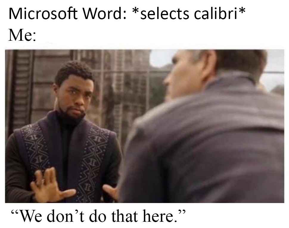
Out of all the fonts to hate, I can’t believe Buttrick chose the OG Times New Roman. I’m an English major, so one might say that I am biased as I have been conditioned to TNR, but still…how can anyone hate TNR so much when Comic Sans exists?? Or that fugly “”Curlz”” font?? Then again, I guess neither of those are regularly used types…but still I will make my case for TNR. I will admit that TNR is not a font that I use in graphic design, unless I really just don’t give a shit or it’s an extremely simple, lowkey material. When it comes to any other use for typing however, especially in MS word, I revert to TNR because it is simple yet fancy. I will ALWAYS prefer a serif font over a sans serif font, and I don’t have any explanation for this other than that I have a penchant for antiquity, and TNR has always emulated that in my opinion.

Because I am ignorant, I forgot that part of submitting my Mini Analysis and Proposal memo included changing the font to something that wasn’t TNR…BUT if I had remembered, I would’ve chosen Book Antiqua. The name kind of gives it away, but it’s extremely similar to TNR. In fact it’s so similar, that the longer I stare at it the more I’m considering switching my loyalty. Antiqua has slightly more exaggerated and sharper feet, and the feetsies are what I love about serif fonts in the first place. It appears to be slightly thicker/larger than TNR as well, so that’s a plus. I will never not defend the usage of TNR!! If you really want to look into a void, try reading research paper after research paper typed in Arial.

If you also prefer serifs to san serifs like me, why? Does your reasoning simply have to do with appearance or is it deeper than that?

Saved from Pinterest.

Is it Copying? Stealing? Or Plagiarizing?

The topic of stealing has always been relevant to the topic of art, as producing art often means putting it into the world and therefore making it subject to criticism and reproduction. To copy or steal appropriately, according to this week’s readings, is the same as being inspired, like covering a popular song and putting your own spin on it. Henry Cheng sums this up nicely in “What I have learned from stealing great designs”: “Originality is rare; what we need is authenticity. Originality means something that’s first or earliest of all, whereas authenticity means something that’s genuine; something that’s made by YOU.” Plagiarism is the equivalent to taking credit where credit is not due, and this is unacceptable in all fields of work. You know you’ve gone too far when your work imitates or mimics another’s instead of modifying or remixing it. As Austin Kleon says in Steal Like an Artist, “In the end, merely imitating your heroes is not flattering them. Transforming their work into something of your own is how you flatter them.

The line between stealing and plagiarizing is clearer when applied to writing, if you ask me. You can pretty much either take someone else’s words and call them your own, which is wrong, or you can paraphrase and make them your own, which is what every writer ever has done essentially. No one has ownership on a type or form of writing, only their own words. Design is more complicated. Let’s say I steal someone’s smiley-face design, but I change the color of it, maybe the thickness of the strokes; is that enough to make it my own? Because technically, I put my own spin on it, but also technically, the original design is still intact. I think stealing is normalized and accepted in both fields of work, each just has its own set of distinct rules on how to steal correctly. I also think, however, despite stealing being easier in the field of writing, it is a more common trend in design. In my experience as an amateur writer and designer, it’s simpler for me to come up with “””original”‘” writing if required as opposed to design.

Why does it seem easier to steal writing than design, when stolen designs are more common to find than stolen writing?

Created by yours truly.

Chronic Wasting Disease :(

Not only did I feel as if I was going to implode internally while purposefully making this atrocious poster, but I also got very depressed reading about deer that get infected with CWD and inevitably rot from the inside out… :/ But moving on for now I guess…I actually (and unfortunately) drew some inspiration for my bad design from other flyers and posters I’ve seen in Cherry Hall and on the WKU website. While I messed with a number of “sins,” the three I mainly focused on from White Space were:

  • Centering Everything
  • Warped Photos
  • Tacky Type

I mainly chose these “sins” because they are the issues I see most often amongst campus flyers. I’d say the problems are both perceptional and cultural — the distortion of the images is distracting while the jumble of bolded/italicized/underlined text makes it difficult to both read and figure out what should be read first. White Space states that centering can make “visual flow issues,” reversing text (like my title) is a no-no because we’re used to reading dark text on light backgrounds, and underlining is a typeset only 13-year-olds use…these are all culturally situated opinions. Those who speak and read Arabic read from right to left, so what would they have to say about an all-centered design? And several cultures around the world don’t put their young children in computer classes where they are forced to learn about Microsoft Word…so they might not hold some kind of judgement about underlining text the way White Space does.

I use a number of the “Tacky Type” variations seriously in my own designs, I just try to use them sparingly and appropriately. I don’t think it’s a design “sin” to underline, reverse, or stroke text as long as there’s a strong purpose behind it, unlike the bad design I came up with. Do you find these text variations to be a problem for you as a reader? Do you think what White Space has to say about “tacky type” is always applicable? Have you seen successful/valid examples of underlining, reversing, stroking or capitalizing in a real-world design?

Everything is Different, But Mostly It’s the Same

For my memoir, I wanted my design to be as simple and self-explanatory as possible without being “boring” or “plain.” What I am lacking in color and glitz I hope to make up for in composition and unity. I wanted to use several photos to depict my growth over the years, obviously, but I ran into the issue of distraction/inconsistency since each photo came from a different period of time, a different location, and was produced on a different type of device. The B&W aims to blend the photos together to create a single concept of development, instead of simply showing four separate stages of my life. The layout of the photos aims to create movement. The eyes may be drawn to the center title first and then move outwards to each corner, or they may start at either corner and across the entire cover, but either way I think viewers will grasp the purpose of the book quickly and easily.

I used InDesign for this assignment and will continue to use it for every assignment, most likely. What really separates ID from programs like Word (for me) is its ability to manipulate photos/visuals with ease. Changing the size, shape, placement and arrangement of a visual is as simple as clicking it and dragging it. If anyone has tried putting several images on a Word document before, you know that it’s not that simple. You gotta change the wrap text settings and then adjust all the surrounding text…too complicated. The only complaint I have about ID is that it lacks the one things Word is great at: identifying text mistakes. ID doesn’t give a shit if you have typos, incorrect grammar or misused punctuation, so I am constantly copying and pasting text from my ID documents to a Word doc to ensure I’m not screwing up. Is anyone an ID expert and have insight as to if this is fixable? Does anyone else in this class prefer ID to other programs for the same/similar reasons as I do?

Break the Rules

“Taking creative license with the rules of [writing] can lead to innovation, which leads us to changing [writing] trends…Bottom line: Don’t break the rules of [writing] out of ignorance. Learn the rules. Then break the rules if you have a reason to.” White Space is Not Your Enemy, pg. 8

As an English major, I’ve spent a good amount of my college education learning the rules of both writing and design. I’ve further learned (through several trials and errors) that failure to meet some of these rules can result in dire consequences, but at other times, a purposeful decision to ignore the rules can be an advantage. For example, it was literally pounded into my skull as a high school student that using first-person in a formal essay was completely unacceptable. Referring to one’s self while writing in academic tone is apparently unprofessional, and this rule stayed relevant up into my first year of college when I was required to take a general education English class. It wasn’t until I was enrolled in some upper-level English courses that my professors started to notice this constant use of third-person, and I was told that just because something is a rule doesn’t mean it must be followed…and from that point on, I have made it a point to break the rules whenever applicable. It typically works out for me.

I keep this same principle in mind when regarding design as well. As the author mentions, graphic design and all its components have recently became “”””democratized,””””” a.k.a. accessible. Anyone who can get ahold of a technological device and/or connect to the internet and download a content-creating app (whether it be Adobe applications or simply paint) can essentially start “designing.” Just because design is accessible, however, doesn’t mean all design is good. This is where having at least some knowledge of design rules can come in handy—you can’t really break the rules in an advantageous way if you don’t even know what the rules are. Writing has definitely been democratized by the internet as well, but I feel like it’s much simpler to google “good writing” and get an actual sense of what that entails than it is to do with design. (Mostly) Everyone can read a piece of writing with good grammar/semantics and one with terrible grammar/semantics and gather what the difference is. It’s much more difficult to compare one design with another and notice mistakes in spacing/composition/color/alignment/clarity without being trained in knowing what you’re looking at. At the end of the day, I’d say if someone really set their mind to it, the internet has provided plenty of sources to self-educate on how to write and design well.

Question: Does anyone else have an experience in which they purposefully broke the rules of design/writing and it worked out for them? An experience in which it backfired?

My cat McChiggen strongly encourages you to break the motherf***cking rules.